Why The Nike Liverpool 22/23 Home Design Is More Than Just A Red Shirt
With two huge fixtures left for them this season, Liverpool’s focus is understandably on the here and now. But following the reveal of their new home shirt for the 22/23 season recently, wider thoughts inevitably shift to the future and the creation of a dynasty.
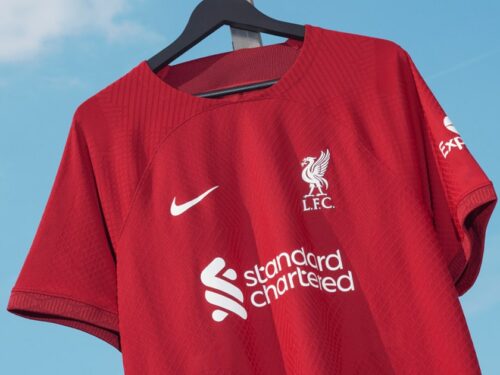
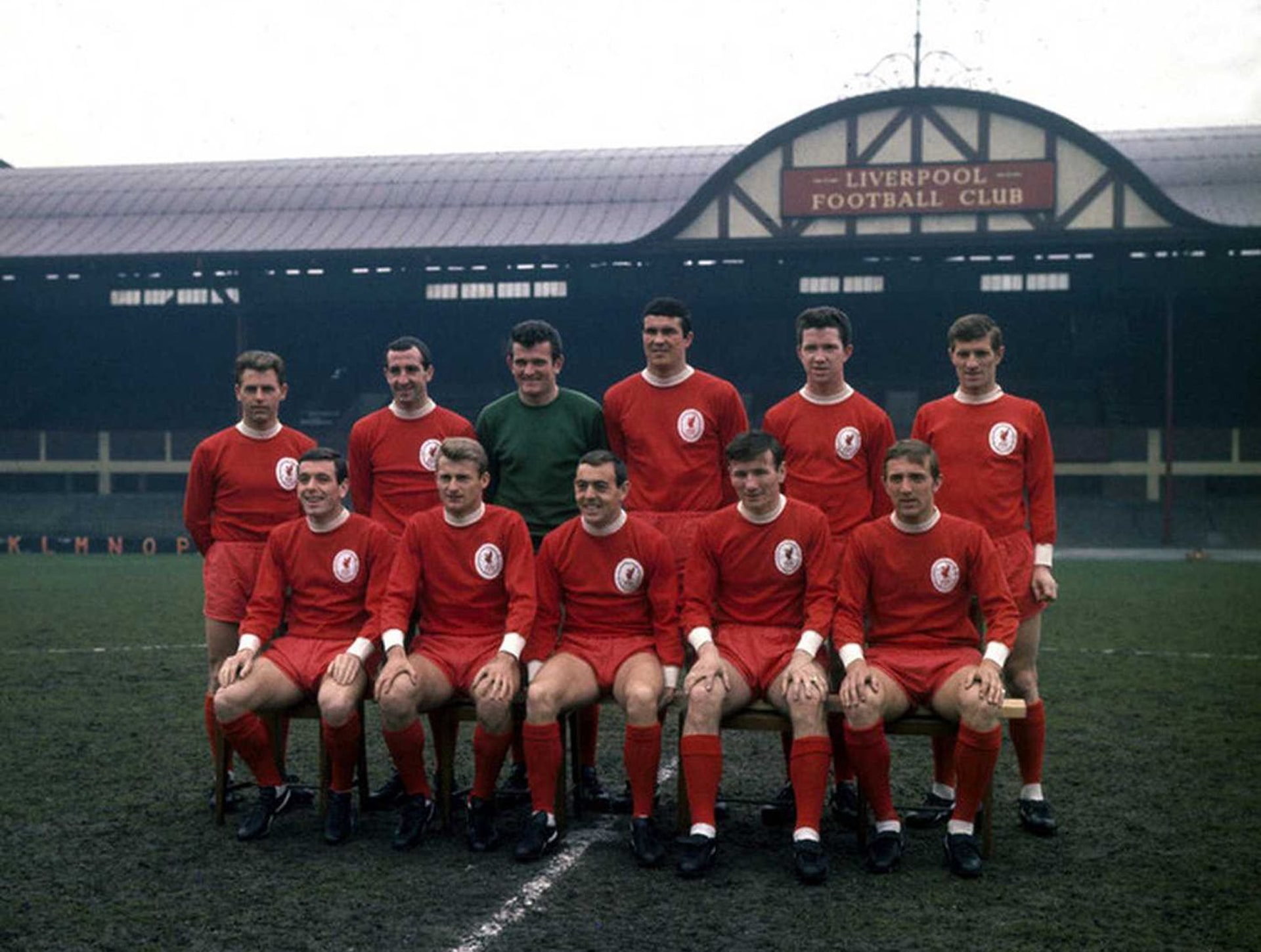
One way or another, Liverpool’s quest for a historic quadruple will come to an end this Sunday, with the Reds set to take on Wolves while Manchester City face Steven Gerrard’s Aston Villa – it couldn’t be set up any more perfectly than that. Unlike previous seasons, the climax will be played out in their current kit, with fans having to wait to see the club’s new home kit for next season – a stripped back offering from Nike that harks back to the 1964-65 season, during which, with legendary manager Bill Shankly at the helm, the club won their first ever FA Cup. Some have accused the simplicity of the design as lacking imagination, but there is something stirring about its ties to the club’s heritage and history.
While Liverpool are synonymous with wearing red – a tradition that has given the side their nickname – it was not until 72 years after the club was formed that they walked across the white line for the for the first time head to toe in the colour. Shankly’s desire to see his side decked entirely in red was born of the idea that the flood of all-red represented “danger and power”, and would therefore help give his side a marginal edge over their opponents.
‘Get into those shorts and let’s see how you look,’ Shankly is reported to have said to team captain Ronnie Yeats. ‘Christ, Ronnie, you look awesome, terrifying. You look seven feet tall!’


Klopp’s side are often praised as mentality monsters, with added impetus always put on that side of their performances, and it’s this parallel interest in the psychological side of competing that links the current Liverpool manager with Shankly, adding another level to the new shirt with the history of the club.
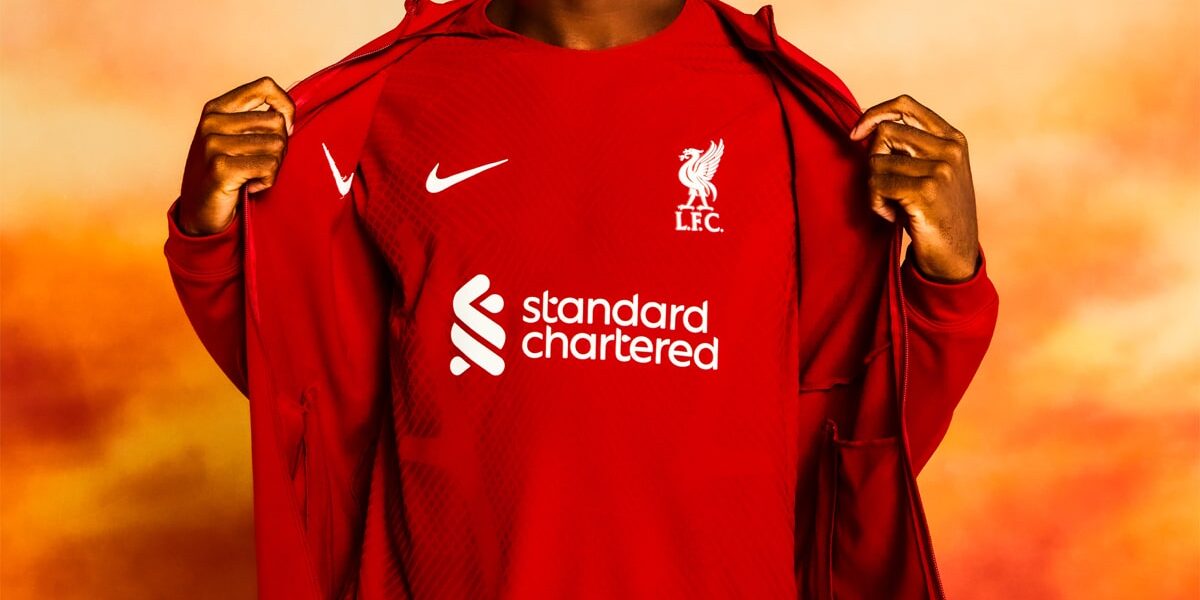
In fact, aside from sponsor, club crest and branding, this is the first completely red shirt for over 70 years; no collar or cuff trim, no under arm panels, no piping – just different tones of red, lining up with red shorts and red socks. The red is in fact, called ‘Tough Red’, which ties into the theme behind the kit’s launch, that of scouse solidarity, representing the mentality of the people of Liverpool, a mentality that makes the city truly unique.
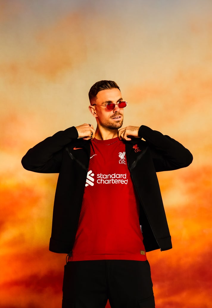

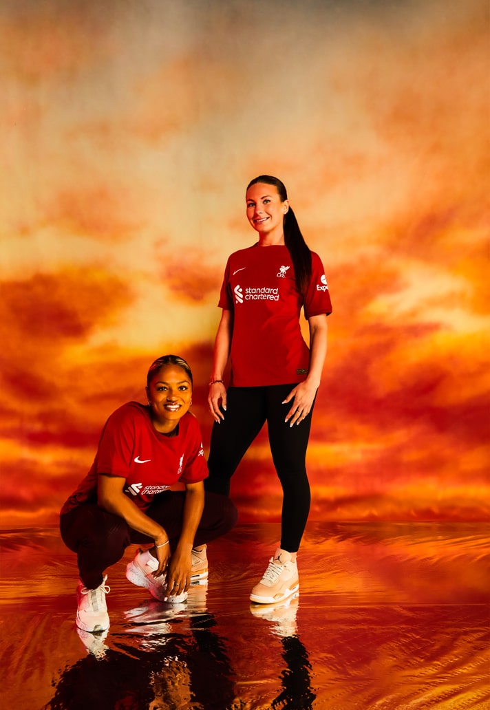


Supporters of Liverpool rally behind the ‘You’ll Never Walk Alone’ mantra, and this is ingrained in the design of this year’s shirt, as well as the wider collection. Intricate “YNWA” detailing features on the sleeve cuff of the shirt, and this is expanded out to dominate the design of the new prematch shirt. The home shirt is granted added definition by the presence of the new Nike authentic 22/23 Vaporknit template, which features a new knit pattern. Further than just the design, the club has also introduced a new LFC name and number style for the back of shirt, which takes inspiration from the city, with a contemporary take on Liverpool’s historic street signs.
Just a plain red design then? Nah, Liverpool’s new home shirt is way more than that.


Pick up the Liverpool 22/23 home shirt now at sidejersey.com


